How to Create a Retro Chrome Text Effect in Adobe Illustrator
In the following steps you will learn how to create a retro chrome text effect in Adobe Illustrator.
For starters, you will learn how to set up a simple grid and how to create a dark background. Using the Rectangular Grid Tool and some basic blending techniques, you will learn how to add a subtle grid to your background.
Taking full advantage of the Appearance panel and using a neat font from Envato Elements, you will learn how to create your fully editable retro chrome text effect. Finally, you'll learn how to add a subtle texture for your entire design.
For more inspiration on how to adjust or improve your final text effect, you can find plenty of resources at GraphicRiver.
Follow along with us over on our Envato Tuts+ YouTube channel:
1. How to Create a New Document and Set Up a Grid
1.
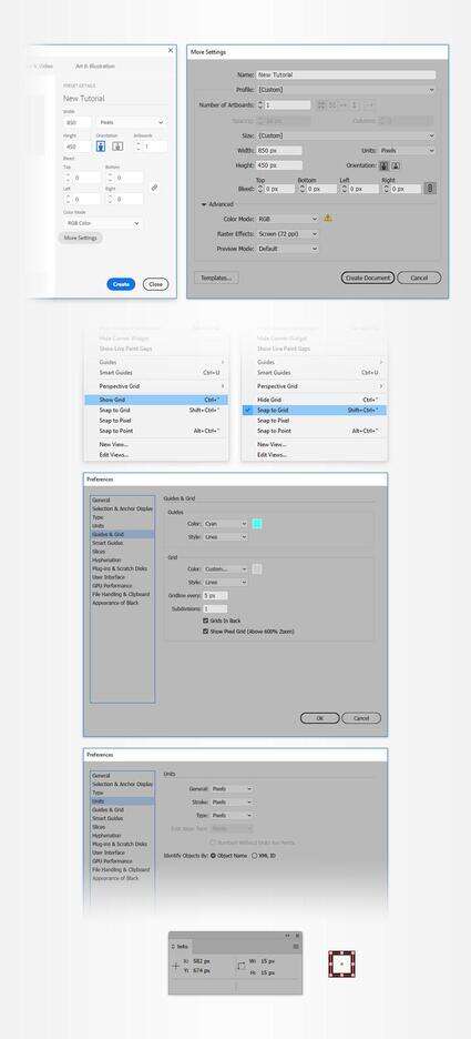
Hit Control-N to create a new document. Select Pixels from the Units drop-down menu, enter 850 in the width box and 450 in the height box, and then click that More Settings button. Select RGB for the Color Mode, set the Raster Effects to Screen (72 ppi), and then click Create Document.
Enable the Grid (View > Show Grid) and the Snap to Grid (View > Snap to Grid). You will need a grid every 5 px, so simply go to Edit > Preferences > Guides > Grid, enter 5 in the Gridline every box and 1 in the Subdivisions box. Try not to get discouraged by all that grid—it will make your work easier, and keep in mind that you can easily enable or disable it using the Control-" keyboard shortcut.
You can learn more about Illustrator's grid system in this short tutorial from Andrei Stefan: Understanding Adobe Illustrator's Grid System.
You should also open the Info panel (Window > Info) for a live preview with the size and position of your shapes. Don't forget to set the unit of measurement to pixels from Edit > Preferences > Units. All these options will significantly increase your work speed.
2. How to Create the Background
2.
Step 1
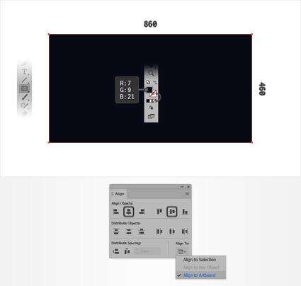
Pick the Rectangle Tool (M) and focus on your Toolbar. Remove the color from the stroke and then select the fill and set its color to R=7 G=9 B=21. Move to your artboard and simply create an 860 x 460 px rectangle—the grid and the Snap to Grid feature should make this easier.
Now, you need to center your rectangle. Make sure that this shape stays selected and open the Align panel (Window > Align). Select Align to Artboard (open the flyout menu and go to Show Options if you can't see the Align To section as shown in the following image) and then simply click the Horizontal Align Center and Vertical Align Center buttons. In the end, your rectangle should cover the entire artboard.
Step 2
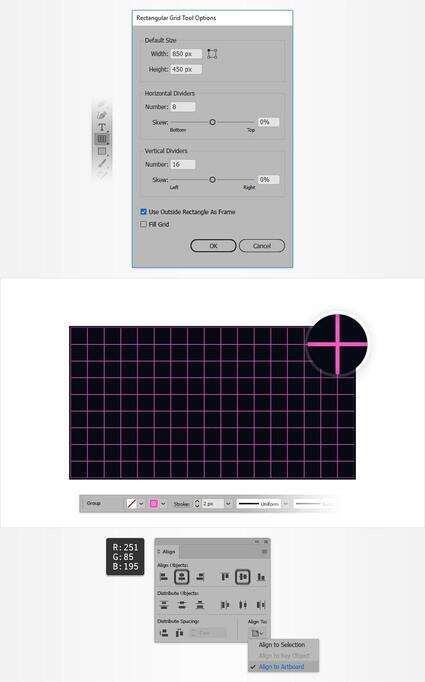
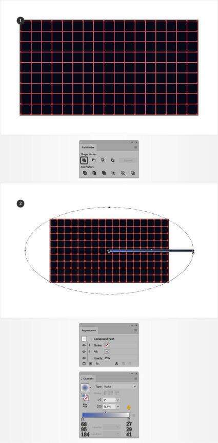
Pick the Rectangular Grid Tool and simply click on your artboard. Enter all the attributes shown in the following image and then click OK.
Center this newly made group of paths and focus on the top bar. Make sure that there's no color set for the fill, change the stroke color to R=251 G=85 B=195, and set the Stroke Weight to 2 px.
Step 3
Make sure that your group of pink paths stays selected and go to Object > Path > Outline Stroke. Move to the Pathfinder panel (Window > Pathfinder) and click the Unite button. Fill the resulting shape with the radial gradient shown below and lower its Opacity to 25%. Keep in mind that the yellow zero from the Gradient image stands for Opacity percentage.
3. How to Create the Chrome Text Effect
3.
Step 1
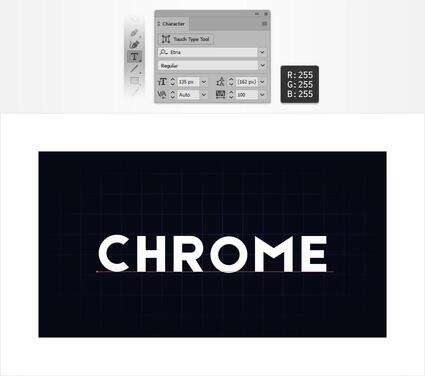
Pick the Type Tool (T) and open the Character panel (Window > Type > Character). Select the Etna font (or any bold font that you may prefer), and set the size to 135 px and the tracking to 100. Simply click on your artboard, add the "CHROME" piece of text, and make it white (R=255 G=255 B=255).
Step 2
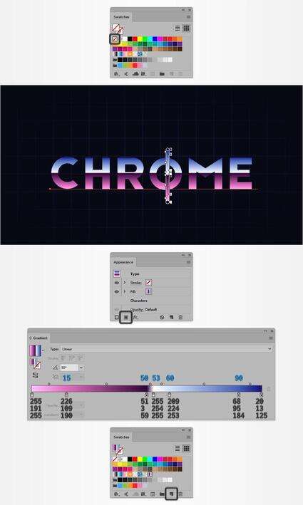
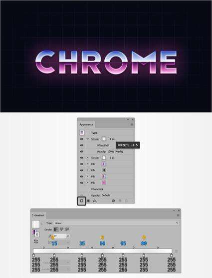
Make sure that your text stays selected and simply remove that white fill color. Move to the Appearance panel add a new fill for your text using the Add New Fill button. Select the new fill and apply the linear gradient shown below. Keep in mind that the blue numbers from the Gradient image stand for Location percentage. Once you're done, save this gradient inside your Swatches panel (Window > Swatches).
Step 3
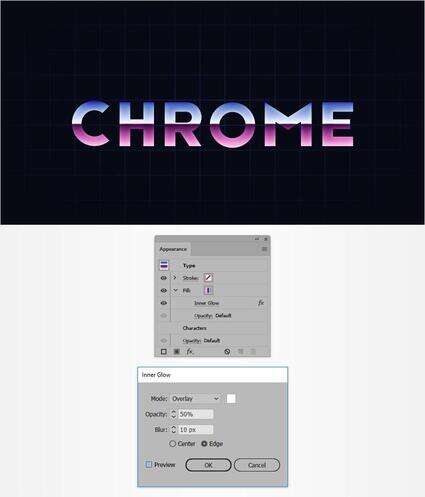
Make sure that your text is still selected and keep focusing on the Appearance panel. Select the existing fill and go to Effect > Stylize > Inner Glow. Enter the attributes shown in the following image and then click that OK button.
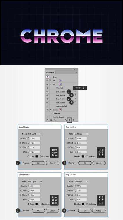
Step 4
Make sure that your text is still selected and keep focusing on the Appearance panel. Select the existing fill and duplicate it using the Duplicate Selected Item button.
Focus on your bottom fill, remove the existing Inner Glow effect, and then go to Effect > Path > Offset Path. Enter a 2 px Offset, click that OK button, and then go to Effect > Stylize > Drop Shadow. Enter the attributes shown in the top left window (in the following image), click the OK button, and then apply the other three Drop Shadow effects shown below.
Step 5
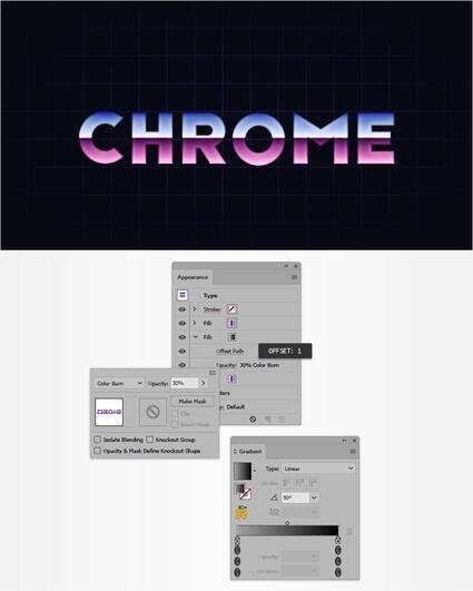
Make sure that your text is still selected and keep focusing on the Appearance panel. Add a third fill and drag it between the existing two fills. Lower its Opacity to 30% and change the Blending Mode to Color Burn, apply the linear gradient shown below, and then go to Effect > Path > Offset Path. Enter a 1 px Offset path and then click OK.
Step 6
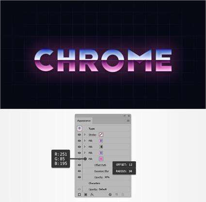
Make sure that your text is still selected and keep focusing on the Appearance panel. Add a fourth fill and drag it below the existing fills. Lower its Opacity to 30%, set the color to R=251 G=85 B=195, and then go to Effect > Path > Offset Path. Enter a 12 px Offset, click that OK button, and then go to Effect > Blur > Gaussian Blur. Enter a 30 px Radius and then click OK.
Step 7
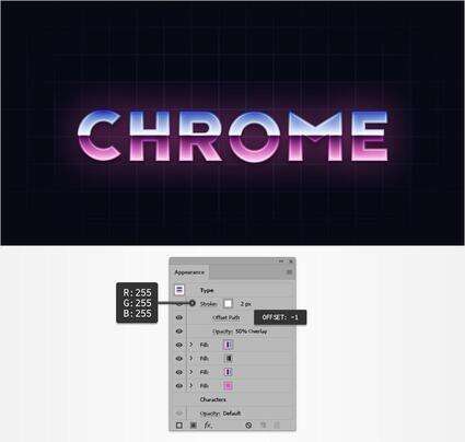
Make sure that your text is still selected and keep focusing on the Appearance panel. Select the stroke, set its color to white, and increase the Weight to 2 px. Lower its Opacity to 50% and change the Blending Mode to Overlay, and then go to Effect > Path > Offset Path. Enter a -1 px Offset and then click OK.
Step 8
Make sure that your text is still selected, keep focusing on the Appearance panel, and add a second stroke using the Add New Stroke button.
Select this new stroke and change its Blending Mode to Overlay. Set the Weight to 1 px, apply the linear gradient shown in the following image, and then go to Effect > Path > Offset Path. Enter a -0.5 px Offset and then click OK.
Step 9
Make sure that your text is still selected, keep focusing on the Appearance panel, and add a third stroke.
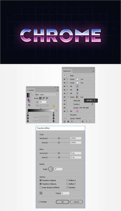
Drag it above the bottom fill, set the Weight to 6 px, and apply the linear gradient shown in the following image. Lower its Opacity to 10%, change the Blending Mode to Soft Light, and then go to Effect > Path > Offset Path. Enter a 3 px Offset, click that OK button, and then go to Effect > Distort & Transform > Transform. Drag the Move-Vertical slider to 2 px and then click OK.
Step 10
Make sure that your text is still selected and keep focusing on the Appearance panel. Add a new fill and drag it to the top of the panel.
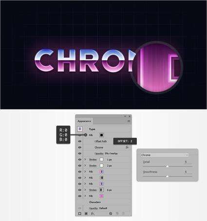
Select your new fill and set the color to black (R=0 G=0 B=0). Lower its Opacity to 5% and change the Blending Mode to Overlay, and then go to Effect > Path > Offset Path. Enter a 2 px Offset, click that OK button, and then go to Effect > Sketch > Chrome. Enter the attributes shown in the following image and then click OK.
4. How to Add a Second Text Effect and a Subtle Texture
4.
Step 1
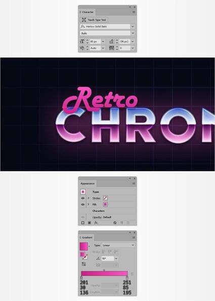
Pick the Type Tool (T) and focus on the Character panel. Select the Harlow Solid Italic font and set the size to 80 px. Click on your artboard and add the "Retro" piece of text. Make sure that your text doesn't have a color set for the fill or for the stroke, focus on the Appearance panel, and add a new fill using that same Add New Fill button. Select it and apply the linear gradient shown below.
Step 2
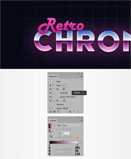
Make sure that your "Retro" text is still selected, keep focusing on the Appearance panel, and add a second fill. Select it and apply the linear gradient shown below. Lower its Opacity to 30%, change the Blending Mode to Overlay, and then go to Effect > Path > Offset Path. Enter a -2 px Offset and then click OK.
Step 3
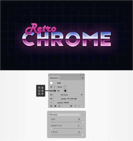
Using the Rectangle Tool (M), create a new 860 x 460 px rectangle and center it. Set the fill color to black, lower its Opacity to 5%, change the Blending Mode to Soft Light, and then go to Effect > Artistic > Film Grain. Enter the attributes shown in the following image and then click OK.
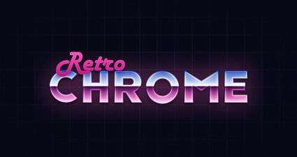
Congratulations! You're Done!
Here is how it should look. I hope you've enjoyed this tutorial and can apply these techniques in your future projects.
Feel free to adjust the final design and make it your own. You can find some great sources of inspiration at GraphicRiver, with interesting solutions to improve your design.