Icon Design: Adobe Illustrator vs. Affinity Designer
As an icon designer, I'm constantly looking for new tools that could help me broaden my creativity, while giving me less clutter to deal with.
As an icon designer, I'm constantly looking for new tools that could help me broaden my creativity, while giving me less clutter to deal with.
For years now, Adobe has been regarded as the king of digital creative suites, but recently more and more alternatives have started to take shape, challenging the giant in the process.
For years now, Adobe has been regarded as the king of digital creative suites, but recently more and more alternatives have started to take shape, challenging the giant in the process.
Today, I'm going to take one of Adobe's most popular products and stack it against Affinity Designer, a competitor that has more and more people wondering if it's time to jump ship and embrace change.
So, if you're into icon design and want to learn how to make icons, whether it's minimal icon design such as a check icon or a blog icon or more complex depictions, this article should help you figure out what software might be a better fit for you.
That being said, let the comparison begin.
1. What Is the Artboard Support Like?
1.
When it comes to creating icons, you’ll probably end up working on projects that involve a larger number of assets, which means that the software that you’re using needs to be able to take full advantage of multiple Artboard project files.
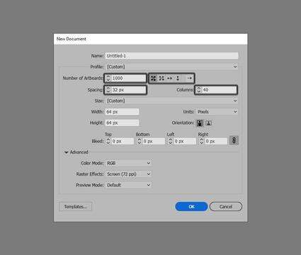
With Illustrator, Adobe has managed to put together a great implementation of this feature, since it has a simple and intuitive process, where you can set up and define multiple Artboards from the start using its New Document window prompt.
This approach is hands down the best one yet, since with each new project file, you can decide on the number of Artboards that you’re going to be using, instead of having to do so later on.
Going beyond basic Artboard implementation, Illustrator allows you to take full control over:
the Number of Artboards: as of now, the software supports a maximum number of 1,000 Artboards
the arrangement methods: Grid by Row, Grid by Column, Arrange by Row, Arrange by Column
the Number of Artboards Per Row
Layout orientation: Right-to-Left or Left-to-Right Layout
Spacing: the distance between each Artboard
Columns: the number of columns in which the Artboards will be stacked
With Affinity Designer, Serif has taken a different route, which in this case is pretty disappointing, since its Artboard support is lacking some of the advanced features found in Illustrator. Once you get used to those features, you can’t really go without them.
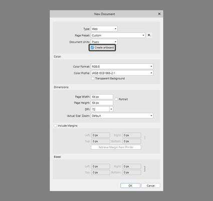
If we go through the process of setting up a new project file using its own version of the New Window prompt, we’ll quickly see that while it lets us use an Artboard to house our assets (which by default comes unchecked), that’s pretty much all we get in terms of Artboard options.
This means that, if you’re hoping to get the same level of control over the spacing found within your Artboards, their column number, etc., you’re out of luck, since you’ll have to go in manually and do it yourself.
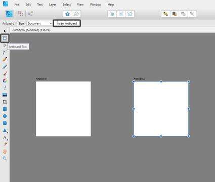
The process of setting up multiple Artboards in itself is pretty annoying, especially when dealing with a larger project, since you’ll have to manually add each Artboard, one at a time.
To do so, you first have to select the Artboard Tool, and then use the Insert Artboard button, which will always add a new Artboard to the right side of the existing one. This can quickly turn into a great source of frustration, since there’s no option of setting up a second row, which means that you’ll end up having a long row of Artboards that you’ll have to manually select and rearrange.
When it comes to the maximum number of Artboards that Affinity allows you to set up, I couldn’t find an official value, so I spent a couple of minutes clicking the Insert Artboard button, and once I reached 999, I was impressed to see that it was still going.
Now, why somebody would actually need 1,000 Artboards is beyond me, but it’s nice to see that the software holds its own when it comes to this particular feature.
2. How Do Smart Guides Behave?
2.
When working on icons, the ability to manually align and/or position composing shapes in relation to one another can quickly make a difference in terms of the amount of tools and buttons you need to use, which will result in a faster workflow.
By default, both programs come with their own versions of smart guides, which behave quite differently, as we will see in the following moments.
While Illustrator’s smart guides implementation is a little more basic from a visual perspective, it does a perfect job at helping us keep track of the center and outer edges of any unselected shape, allowing us to quickly position our active shape in relation to them.
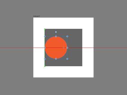
For example, if we needed to align a circle to the left edge of a larger underlying square, we can easily do so by first selecting the shape, and then simply dragging it into the desired position, which will immediately trigger the smart guides.
Once the guides become active, they help us maintain a straight line while dragging, immediately snapping the circle’s bounding box to the edge of the square.
To make things more precise, the software lets us keep track of the number of pixels traveled by our shape through the help of a dedicated info panel, which will indicate the X and Y distances (dX & dY).
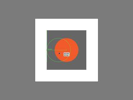
When it comes to manually positioning a shape, this feature is actually really helpful, but unfortunately it only works when using a click-and-drag approach, since if you nudge the shape with the help of the directional arrow keys, the info panel will remain hidden.
If we switch over to Affinity, we’ll quickly notice that its version of smart guides behaves pretty much identically. The only key difference is that this time around the software doesn’t come with a dedicated panel meant to keep track of the number of pixels that the active shape has traveled.
While Affinity doesn’t give us the option of keeping track of the distance traveled by an active shape, it does however come with a way better feature: distance tracking between multiple shapes.
For example, let’s say that we want to position our circle 4 px from the square’s bottom edge. In Illustrator, we would first have to align the circle to the edge of the square, and then push it downwards by said distance.
In Affinity, we can easily keep track of the distance found between our circle and the larger square, either by clicking and dragging or using the directional arrow keys, which will immediately give us an indicator of the spacing value found between the two.
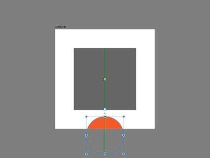
The only thing that you need to keep in mind is that as of now, this feature only works with non-overlapping shapes.
For me personally, this approach makes it an essential feature that any icon designer should have and use, which is something that I wish Adobe had implemented in Illustrator for a long time now.
3. How Is the Pixel Preview Support?
3.
When working on icons, there are a couple of tools that are essential to figuring out the size and position of their composing shapes, one of those being the ability to view the actual Pixel Grid.
With Illustrator, Adobe has the best Pixel Preview support to date, since it allows us to view the actual pixel fabric onto which our icons will rest.
By default, the view mode is disabled, but you can easily switch back and forward by heading over to View > Pixel Preview or by using the Alt-Control-Y keyboard shortcut.
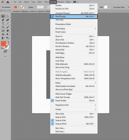
Once in Pixel Preview mode, we’ll be able to create and adjust any given shape by taking full advantage of the Pixel Grid. By doing so, we can figure out shape sizes more easily and have a clear view of their spacing and positioning, instead of throwing random shapes all over the place.
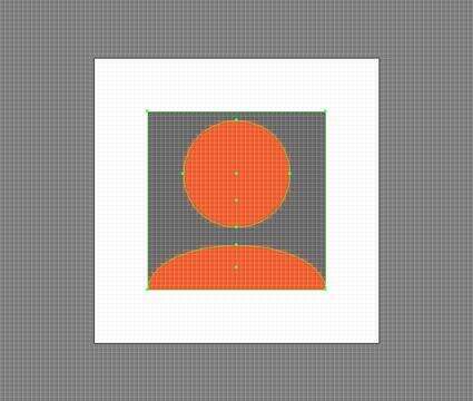
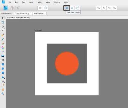
If we switch over to Affinity Designer, unfortunately true Pixel Preview support is lacking in a big way, since the available Pixel view mode substitute simply shows us how our design would look at a pixel level, but we can’t see or take advantage of the Pixel Grid.
4. How Does Pixel Snapping Behave?
4.
When it comes to creating pixel-perfect icons, we need to make sure that every shape that we create is perfectly snapped to the underlying Pixel Grid, so that in the end we’ll have a sharp-looking product.
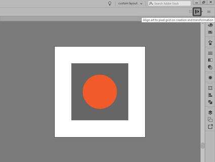
In Illustrator, we can turn on pixel snapping either by heading over to View > Snap to Pixel or by clicking on the Align art to pixel grid on creation and transformation button, which can be found on the upper-right corner of the interface.
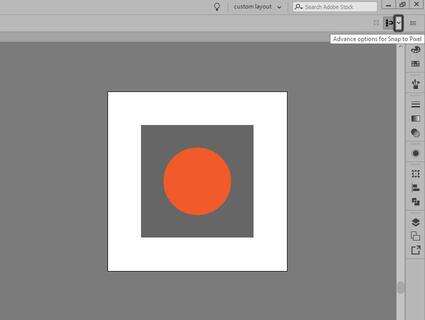
Recently, Adobe has introduced a dedicated Pixel Snapping Options panel, which we can access by clicking on the little downward-facing arrow found next to the Align art to pixel grid on creation and transformation button.
Once the panel is visible, we’ll be greeted by three different categories of options that control pixel snapping while drawing, moving, and scaling. These are pretty self-explanatory since if we hover over them, we’ll get a little demonstration of that specific feature.
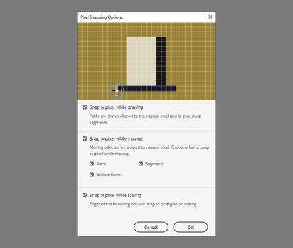
In terms of the pixel snapping itself, the features behave exactly as advertised, since each shape that you create perfectly snaps to the underlying Pixel Grid, no matter what you do to it.
Affinity Designer uses a similar approach, where we get three dedicated buttons: one to Force Pixel Alignment, one to Move By Whole Pixels, and another one to control advanced Snapping.
Quick tip: you can always access the Snapping Manager by heading over to View > Snapping Manager.
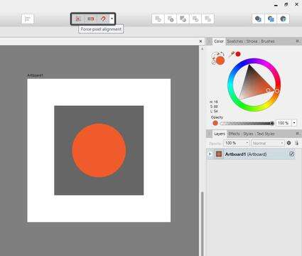
Compared to Adobe, the snapping options are quite interesting this time around, since we get a whole new level of control, even though not all of them are directly linked to pixel snapping.
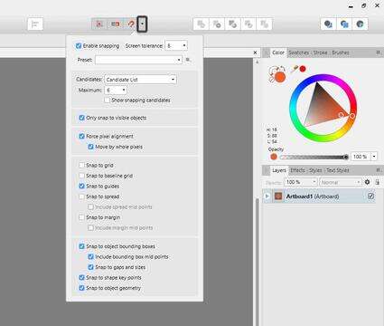
As with Illustrator, pixel snapping behaves exactly as you would expect, with each shape occupying whole pixels, which is exactly what we want.
5. What Is the Grid Support Like?
5.
When working on icons, you’ll often need to set up some building guidelines to help you define your assets, which are mostly created using Grids.
By doing so, you allow yourself to create your composing shapes using similar sizing values that are created by taking advantage of the gridline system.
Illustrator comes with a dedicated Grid, which can be turned on by heading over to View > Show Grid.
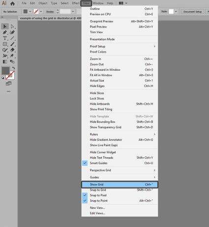
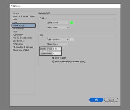
To set up a custom Grid, we need to head over to Edit > Preferences > Guides & Grid where we can adjust the Gridline every and Subdivisions options.
As you can see, Adobe doesn’t give us a whole lot of settings when it comes to setting up a custom Grid, which makes the feature feel outdated.
If we switch over to Affinity, well let’s just say that its implementation of the Grid is quite impressive, since you get a dedicated manager that you can customize and adapt for multiple styles of artwork.
To access the tool, we need to head over to View and then simply click on Grid and Axis Manager.
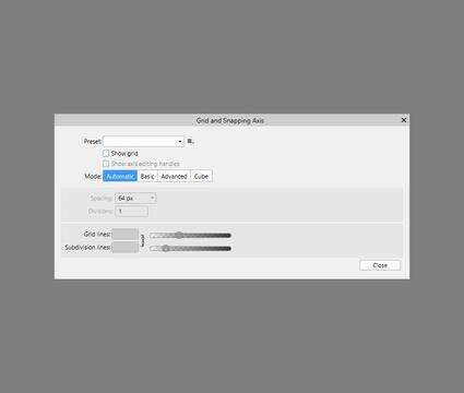
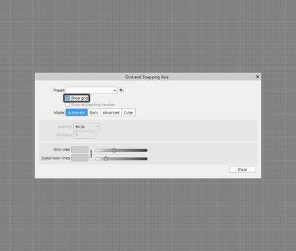
Once the manager is visible, we can check the Show Grid option, which should make it active throughout the entire document.
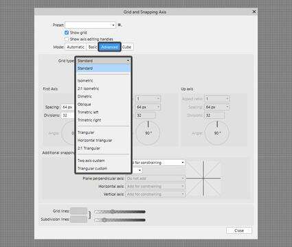
Next we have Mode, which is where Affinity truly sets itself apart, since you can choose to go with Basic, which is what Illustrator currently offers, or you can go with Advanced and choose from the different available Grid type options.
As you can see, the number of options is quite impressive, so if you’ve ever wanted to try to design isometric icons, this might be the time to do so.
6. How Is the Asset Export Process?
6.
Finally, let’s talk about asset export, which is an equally important step in the process of creating icons. When dealing with a larger project, you need to make sure that your creative suite of choice is capable of handling the workload.
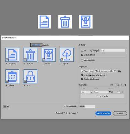
With Illustrator, Adobe has introduced a dedicated exporting tool, called the Asset Export panel, which can be found within the Layers and Artboards panel group.
To export a set of icons, we first have to add them to the panel, either by clicking and dragging them over or by using the Generate multiple assets from the selection button.
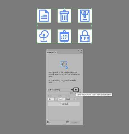
Once we’ve generated our selection of assets, all we have to do is click on the Launch Export for Screens dialog button, which will allow us to adjust our export settings and even add size and format variations based on our needs.
As you can see, the process itself is really straightforward, since all you have to do is click a few buttons and you’re good to export.
Affinity Designer does things a little bit differently, since it comes with what Serif calls an Export Persona, which can be found within the upper-left corner of the application.
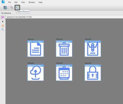
Once we’ve switched over to the Export Persona, the application will change, giving us a dedicated Export Options panel, where we can control all the different available settings.
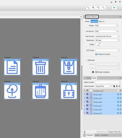
All we have to do to export the icons is check their little checkboxes first, and then simply click on the Export Slices button, which will ask us for a location to store the resulting files.
While the exporting process isn’t all that bad, I personally think that what Illustrator offers is more streamlined and easier to use.
At this point, we’ve managed to cover and compare the key features that you should know when deciding which software is right for you, so it’s now time to move on to the conclusion part of our little discussion.
Conclusion
Through its unique features and ease of use, Illustrator once again proves to hold its own, which I why I believe that for now it’s the best icon design suite out there that you can acquire and use.
The main points that lead to this conclusion are:
advanced Artboard support
advanced pixel preview mode integration
overall better asset export support
That being said, I truly hope this information comes in handy when it comes to deciding which creative suite might be a better fit for you, and if you have any questions in regards to the subject, feel free to post them within the comments section, and I’ll get back to you as soon as I can.
Further Develop Your Icon-Building Skills
Just finished going through this in-depth article, and feel like learning more? Well, if that’s the case, you’re in luck, since I took the time to put together this little list that should keep you going for the following days!
Best Software for Icon Design: Photoshop vs. IllustratorAs a designer, you've probably wondered which Adobe product does a better job when it comes to the process of creating icons. Some love Photoshop, others...
Andrei Stefan
23 May 2019
Icon Design
Different Image File Types and FormatsFrom file type to file format, we're going to explore the meaning of these notions and learn what are the most common images that are used right now.
Andrei Stefan
15 Nov 2018
Graphic Design
The Do's and Don'ts of Creating Line IconsLearn how to create line icons both in Adobe Illustrator and Affinity Designer, and see how you can craft a usable finished product using a few basic shapes.
Andrei Stefan
17 Sep 2018
Icon Design
How to Create a Text Editor Icon Set in Adobe IllustratorIn today’s tutorial, we’re going to tackle another icon project, in which we’re going to gradually learn how to create a set of text editor elements, using...
Andrei Stefan
07 Mar 2018
Icon Design
How to Create a Set of Office Icons in Affinity DesignerIn this Affinity Designer tutorial, you’re going to learn how to create a set of office icons using some simple geometric shapes that we will adjust here and...
Andrei Stefan
28 Feb 2018
Affinity Designer
How to Create 10 Common Icons and Their Variations in Adobe IllustratorTo celebrate our tenth birthday, learn how to create a set of ten must-have UI icons, using the most basic shapes and tools that Illustrator has to offer.
Andrei Stefan
04 Sep 2017
Icon Design
How to Create a Summer-Themed Icon Pack in Adobe IllustratorSince summer is already upon us, I thought it would be nice to treat you to a little icon tutorial using some of the most common accessories that you would...
Andrei Stefan
03 Jul 2017
Summer
How to Create a Stylish Accessories Icon Pack in Adobe IllustratorIn today’s tutorial we’re going to get our fashion on and learn how to create a stylized set of accessories icon pack, using the most basic shapes and tools...
Andrei Stefan
21 Jun 2017
Icon Design
How to Make a Check IconAlways wanted to learn how to create a check icon, but never knew exactly where to start? In this tutorial, you'll learn how to create a check icon in Adobe...
Andrei Stefan
07 Mar 2019
Icon Design
How to Make a Filter IconAlways wanted to learn how to create a filter icon, but never knew exactly where to start?
In this video, you'll learn how to create two variations of the...
Andrei Stefan
29 May 2019
Icon Design